HealthCare.gov has become a household name, and not for all the right reasons. It is an educational resource helping all Americans know their healthcare options and rights. It is also the home of the Health Insurance Marketplace, the exchanges established under the Affordable Care Act. It is also a project that I have a long and deep personal connection to.
HealthCare.gov was not born at the time of its much-publicized problems in October 2013. It originally launched July 1, 2010 and was considered a good example of government service done right 1. Over the next three years, it had a few significant releases and numerous minor improvements prior to a June 2013 re-launch and the introduction of the Health Insurance Marketplace in October.
I worked on both versions. In 2010, after I posted an unsolicited concept piece, I was asked to join the team creating what would become HealthCare.gov. In 2012, I was asked to come back and work on the next version. It has been the most challenging and most rewarding work I’ve been a part of.
Healthcare reform has been an unfortunately contentious topic. The animosity between the two sides is a driving contextual factor in the implementation of the Act. It makes many things more difficult than they would be otherwise. It’s useful to remember this reality when thinking about HealthCare.gov. For one, it makes talking about the project more complicated. In talking about my role, I’m limited in what I can say, so I’ll stick with information already publicly available.
2012-13 (Version 2.0 / Exchange)
Initial involvement
Having played a significant role in the first version of HealthCare.gov, I was asked in the fall of 2012 to work on similar aspects for the upcoming version, the launch of the Health Insurance Marketplace. A lot of work had been underway, particularly on the technical side. I was joining an effort to look at the overall experience and help make it as user-friendly as possible. Initially this involved: considering lessons learned from HealthCare.gov up to that point; understanding the new needs, requirements, difficulties, and context; and helping to shape a unified consumer-oriented experience within the current constraints. This took form as ideation and broad-strokes design concepts, largely for discussion to aid decision-making.
Sonya / design direction
Next I was part of a small sprint team tasked with setting the design direction of HealthCare.gov 2. Our purpose was to conceptually define how all consumer experiences could work together, from outreach, engagement, and education, through application and enrollment. This was done with a strict focus on the consumer, who we personified as Sonya 3.
Production
Building on the design direction, I worked with a number of people producing materials and design specifications for the development teams to use for two separate launches: the June educational/redesign launch and the October Marketplace launch. This involved the typical tasks of a user experience designer: coordination, planning, consensus-building across teams, development of wireframes, UI design planning, diagrams, explanatory materials, etc.
Educational launch
In June 2013, the HealthCare.gov redesign launched. This release was purely educational in nature, aimed at providing information and resources to people ahead of the Marketplace launch in October. It featured an entirely reimagined information architecture, dramatic simplification of content, new visual design and interaction patterns—particulary the navigation and “card, canvas, controls” motif—that anticipated the upcoming functionality of the Marketplace.
This launch went off without a hitch and the technology implemented continued to perform flawlessly in autumn despite the other problems that arose 4. Alex Howard profiled the launch in The Atlantic.
October Health Insurance Marketplace launch
Given the poor performance at launch, it must be said that no person involved with the October launch considers it close to satisfactory. It was a famously bad launch. That said, I remain proud of the work I contributed to the effort and am happy to have been a part of the project as a whole.
I worked on UX design issues across the overall customer journey: from the planned anonymous browsing 5 to account creation to the application process to eligibility determination and the enrollment process. With others, I worked to create flows, transitions, tools, and processes that helped get people through a complicated set of constraints. With others, I tried to keep the focus on real people, with their own hectic lives, navigating a health care system that isn’t easy.
-

Screenshot of my own application
-

Screenshot of my own application
-

Screenshot of my own application
-
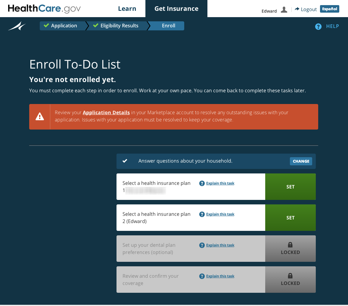
Screenshot of my own application
-

Screenshot of my own application
-

Screenshot of my own application
-

Screenshot of my own application
At launch, the results were almost entirely negative. But there are increasingly positive signs the live experience is getting closer to the designed experience.
So far—I’m writing this mid-February—over 5 million people 6 have enrolled in coverage through HealthCare.gov, making their way through a process with very complicated requirements. (Many more have enrolled through other methods.) About three-fifths of those have been people qualified for Medicaid, which means they were required to provide considerable financial and personal information. About two-thirds of the people end up getting coverage through private plans, with or without subsidies. The user experience is more complex for people who may be eligible for financial assistance or whose finincial situation is harder to determine because more information needs to be requested in order to check eligibility. People not seeking financial assistance have a shorter application. For people seeking private plans, there is the added complexity of choosing a plan that will be a good fit for their needs.
The images above are composite screenshots from my own HealthCare.gov application, through which I enrolled in coverage for my family. Our current plan will save us thousands over the plan we bought for ourselves last year.
My work with HealthCare.gov came to a close shortly after launch as planned.
In closing
In writing this, I am trying to be straight. I am a pragmatic designer. I don’t aspire to make perfect little things. I aspire to participate in meaningful, impactful work; to contribute what I can to hopefully produce better outcomes than if I had not been involved. I won’t hide a year’s worth of hard work or disassociate myself with a project for convenience.
I’m also not interested in glossing over the thouroughly disappointing parts. There are many things that I’m not happy about. There have been victories and missed opportunities; mistakes in judgement and process as well as heroic efforts and brilliant contributions. I’m concurrently proud of the successes of HealthCare.gov and disappointed by the poor roll-out. Such is life, I guess.
2010 (Version 1.0 / Initial Launch)
In 2010, I was invited to join The U.S. Department of Health and Human Services team as design lead for HealthCare.gov, a new website mandated by the recently passed Affordable Care Act. (How this came to be is a rather interesting story.)
I worked to help the team define the scope and breadth of the site and how it might be structured. I created paper models to get the team on the same page, designed and presented solutions to leadership, created the visual style, and oversaw design production.
-

Sketches and early studies for architecture of site
-

Sketches and early studies for architecture of site
-

Sketches and early studies for architecture of site
-

Sketches and early studies for architecture of site
-

Integrated site architecture paper model
-

Integrated site architecture paper model
-

Anatomy of HealthCare.gov
-

Homepage
-

“Finder” homepage: The process for discovering the options available to you is two short steps
-

Menu of available options to you: This varies based on the answers you’ve submitted
-

Private insurance plan listing
-

Private insurance plan page based on existing research/subject matter expertise was field tested
-

Audience-focused section
-
Timeline
It was a whirlwind project, working closely with Todd Park, Macon Phillips, and the internal HHS team, we launched after only two months work on July 1, 2010. We rolled out updates over the next few months. After five months, I returned to the private sector and my own practice.
VIDEO: Behind Healthcare.gov: How Washington Is Drawing Inspiration From Silicon Valley, Twitter - Former White House Director of New Media, Macon Phillips, and Former U.S. Department of Health & Human Services CTO, Todd Park, discuss the process of bringing HealthCare.gov to life, how I came to be involved with the project, and my role in it. (TechCrunch/Evelyn Rusli)
This initial version of HealthCare.gov was the first time ever citizens could view every individual private insurance option available to them in one place, as well as other healthcare programs. The site parsed billions of potential options and presented a usable menu of applicable healthcare options tailored to the user.
The launch went well and received largely favorable reviews: NPR, Time, Consumer Reports, The Washington Post, The Christian Science Monitor, Kaiser Health News, CBS, Huffington Post, Ezra Klein, Jonathan Cohn, Craig Newmark, Jill Lawrence, and others.
Photo at top CC BY 2.0 by David Fulmer
 Default: Small
 Small 1
 Small 2
 Medium
 Medium 1
 Medium 2
 Large
Large Large 1
 Large 2